5강: AI 기반 질병 예측 분석
BBP WGS 분석 튜토리얼
학습 목표
- 유전체 변이 정보를 Feature Matrix 로 변환 - 샘플 × 변이 행렬 구축 및 전처리
- Mutational Signature 분석 및 NMF 기반 패턴 추출 - SBS96 context matrix + Non-negative Matrix Factorization
- 머신러닝 모델을 이용한 질병/형질 예측 - 유전자형 기반 예측 모델(Logistic Regression, Random Forest 등) 학습 및 평가
사용 데이터
데이터 루트: /tier4/DSC/jheepark/bbp-wgs-data/
| 데이터 | 경로 | 설명 |
|---|---|---|
| 코호트 VCF | cohort/cohort_chr22.vcf.gz | 4강에서 생성한 Unrelated × Biallelic SNP VCF (2,495 샘플) |
| 통합 샘플 정보 | phenotype/integrated_sample_info.tsv | 샘플별 super_pop / pop / gender |
| HCC1395 Somatic VCF | individual/somatic/HCC1395_somatic.chr22.vcf.gz | Mutational signature 실습용 (chr22 SNV 627개) |
| 1000G 개인 샘플 | individual/ALL.chr22.phase3_shapeit2_mvncall_integrated_v5b.20130502.genotypes.vcf.gz | 추가 Germline 샘플 mutation context 수집용 |
산출물 (본 강의에서 생성)
| 파일 | 경로 | 설명 |
|---|---|---|
| Feature Matrix | cohort/feature_matrix.npz | 샘플 × SNP dosage 행렬 (sparse) |
| SBS96 Context Matrix | cohort/sbs96_matrix.tsv | 샘플별 96 mutation type counts |
| NMF Signatures | cohort/nmf_signatures.tsv | NMF 로 추출된 K 개 signature weight |
| ML 예측 결과 | cohort/ml_predictions.tsv | 샘플별 예측 라벨 + confidence |
사용 도구
- Python: scikit-learn, numpy, pandas, scipy, matplotlib, seaborn
- cyvcf2 (VCF 파싱)
- (선택) SigProfilerExtractor, COSMIC SBS signatures
0. 환경 설정
python
import os
import subprocess
from collections import Counter, defaultdict

import pandas as pd
import numpy as np
import matplotlib.pyplot as plt
import seaborn as sns
from scipy import sparse
from cyvcf2 import VCF
from matplotlib import font_manager, rc
import warnings
warnings.filterwarnings('ignore')

# scikit-learn
from sklearn.model_selection import train_test_split, cross_val_score, StratifiedKFold
from sklearn.preprocessing import StandardScaler, LabelEncoder
from sklearn.decomposition import PCA, NMF
from sklearn.linear_model import LogisticRegression
from sklearn.ensemble import RandomForestClassifier, GradientBoostingClassifier
from sklearn.metrics import (accuracy_score, classification_report,
                              confusion_matrix, roc_auc_score, roc_curve)

# 시각화
sns.set_style('whitegrid')
sns.set_palette('Set2')
font_path = '/usr/share/fonts/truetype/nanum/NanumGothic.ttf'
font_manager.fontManager.addfont(font_path)
rc('font', family='NanumGothic')
plt.rcParams['axes.unicode_minus'] = False
plt.rcParams['figure.figsize'] = (12, 6)
plt.rcParams['font.size'] = 12

# ==========================================================================
# ★★★ 데이터 위치 설정 ★★★
# 아래 BASE_DIR 한 줄만 본인 환경에 맞게 수정하세요.
# 나머지 하위 경로는 BASE_DIR 기준으로 자동으로 만들어집니다.
# 예) 내 홈에 데이터를 두었다면:  BASE_DIR = '/home/내아이디/bbp-wgs-data'
# ==========================================================================
BASE_DIR = '/tier4/DSC/jheepark/bbp-wgs-data'

# --- 아래는 수정할 필요 없습니다 (BASE_DIR 기준 하위 디렉토리) ---
DATA_DIR       = BASE_DIR                              # (이전 코드 호환용 별칭)
COHORT_DIR     = os.path.join(BASE_DIR, 'cohort')      # 코호트 산출물
PHENOTYPE_DIR  = os.path.join(BASE_DIR, 'phenotype')   # 표현형/임상 데이터
INDIVIDUAL_DIR = os.path.join(BASE_DIR, 'individual')  # 개인/1000G VCF
ANNOTATION_DIR = os.path.join(BASE_DIR, 'annotation')  # ClinVar 등 주석 DB
SOMATIC_DIR    = os.path.join(INDIVIDUAL_DIR, 'somatic')  # somatic VCF

# 데이터 위치가 올바른지 즉시 확인 (처음 실행 시 여기서 막히면 BASE_DIR 를 점검)
assert os.path.isdir(BASE_DIR), f'[경로 오류] BASE_DIR 가 존재하지 않습니다: {BASE_DIR}'

COHORT_VCF = f'{COHORT_DIR}/cohort_chr22.vcf.gz'
INTEGRATED_TSV = f'{PHENOTYPE_DIR}/integrated_sample_info.tsv'
SOMATIC_VCF = f'{SOMATIC_DIR}/HCC1395_somatic.chr22.vcf.gz'
GERMLINE_VCF = f'{INDIVIDUAL_DIR}/ALL.chr22.phase3_shapeit2_mvncall_integrated_v5b.20130502.genotypes.vcf.gz'

# 랜덤 시드
RANDOM_STATE = 42
np.random.seed(RANDOM_STATE)

print('환경 설정 완료!')
print('데이터 위치(BASE_DIR):', BASE_DIR)
print(f'Cohort VCF : {COHORT_VCF}')
print(f'Somatic VCF: {SOMATIC_VCF}')
text
환경 설정 완료!
Cohort VCF : /tier4/DSC/jheepark/bbp-wgs-data/cohort/cohort_chr22.vcf.gz
Somatic VCF: /tier4/DSC/jheepark/bbp-wgs-data/individual/somatic/HCC1395_somatic.chr22.vcf.gz
1. 유전체 변이를 Feature Matrix 로 변환
이 단계에서는 VCF 안의 변이 정보를 머신러닝이 먹을 수 있는 숫자 표(행렬) 로 바꿉니다. 머신러닝 모델은 글자나 유전형 기호가 아니라 숫자만 입력받기 때문입니다.
- Feature matrix(특징 행렬): 행은 샘플(사람), 열은 변이(SNP), 각 칸은 그 사람이 해당 위치에 가진 변이 정보를 담은 표입니다. 머신러닝의 "입력 데이터" 전체를 뜻합니다.
1.1 Feature Matrix 의 구조
머신러닝 모델에 유전체 데이터를 입력하려면 샘플 × 변이 행렬로 변환해야 합니다. 각 원소는 해당 샘플의 해당 변이에서의 alt allele dosage (0/1/2) 입니다.
dosage(도즈, 0/1/2): 한 사람은 한 위치에 대립유전자(allele)를 2개 가집니다. 그중 변이(alt) 대립유전자가 몇 개인지를 센 값입니다. 0 = 변이 없음, 1 = 한쪽만 변이(heterozygous), 2 = 양쪽 모두 변이(homozygous).
$$X_{ij} = \text{alt allele dosage of sample } i \text{ at variant } j \in {0, 1, 2}$$
| Matrix 형태 | 크기 예시 | 용도 |
|---|---|---|
Dense numpy.ndarray | 작은 코호트 (< 10k SNP) | 빠른 연산 |
| Sparse CSR matrix | 대부분의 WGS 데이터 | 메모리 효율 |
| PLINK BED | 전체 게놈 규모 | 전용 도구 |
sparse matrix(희소 행렬): 대부분의 칸이 0인 행렬입니다. 유전체 데이터는 대다수 사람이 대다수 위치에서 변이가 없어(=0) 표의 70% 이상이 0입니다. 이때 0이 아닌 값만 따로 저장하면 메모리를 크게 아낄 수 있는데, 그 방식이 sparse matrix 입니다.
1.2 Feature Matrix 구축
2,495 샘플 × 수천 SNP 규모라 sparse matrix 로 구축합니다.
python
# 코호트 VCF → genotype matrix
# 속도를 위해 처음 N_SNP 개 변이만 사용
N_SNP_LIMIT = 20000  # 학습용 샘플링

vcf = VCF(COHORT_VCF)
sample_ids = vcf.samples
print(f'샘플 수: {len(sample_ids)}')

rows_idx = []    # 변이 인덱스
cols_idx = []    # 샘플 인덱스
data_vals = []   # dosage
variant_meta = []

for i, v in enumerate(vcf):
    if i >= N_SNP_LIMIT:
        break
    gts = v.genotypes
    for j, gt in enumerate(gts):
        a1, a2 = gt[0], gt[1]
        if a1 < 0 or a2 < 0:
            continue
        d = (a1 == 1) + (a2 == 1)
        if d > 0:
            rows_idx.append(i)
            cols_idx.append(j)
            data_vals.append(d)
    variant_meta.append((v.CHROM, v.POS, v.REF, v.ALT[0] if v.ALT else '.'))
vcf.close()

n_variants = len(variant_meta)
X_sparse = sparse.coo_matrix(
    (data_vals, (cols_idx, rows_idx)),
    shape=(len(sample_ids), n_variants)
).tocsr()

print(f'Feature Matrix: {X_sparse.shape}')
print(f'  Sparsity: {1 - X_sparse.nnz / (X_sparse.shape[0] * X_sparse.shape[1]):.3%}')
print(f'  Non-zero entries: {X_sparse.nnz:,}')
샘플 수: 2495
Feature Matrix: (2495, 20000)
Sparsity: 72.747%
Non-zero entries: 13,599,438
1.3 Phenotype label 로딩 및 정렬
python
# Phenotype: super_pop 으로 예측 task 구성 (EAS vs Non-EAS)
integrated = pd.read_csv(INTEGRATED_TSV, sep='\t')

pheno_map = integrated.set_index('sample')['super_pop'].to_dict()
y_super_pop = np.array([pheno_map.get(s, 'Unknown') for s in sample_ids])

# 각 super_pop 분포
print('=== Super Population 분포 ===')
print(pd.Series(y_super_pop).value_counts())

# Binary task: EAS vs Non-EAS
y_binary = (y_super_pop == 'EAS').astype(int)
print(f'\n이진 label (EAS=1):')
print(f'  Case (EAS)    : {(y_binary == 1).sum():,}')
print(f'  Control       : {(y_binary == 0).sum():,}')
=== Super Population 분포 ===
AFR 658
EAS 503
EUR 499
SAS 488
AMR 347
Name: count, dtype: int64
이진 label (EAS=1):
Case (EAS) : 503
Control : 1,992
1.4 MAF 기반 feature 축소
수만 개 SNP 중 정보량이 높은 common variant 만 남깁니다. MAF ≥ 0.05 인 SNP 만 사용합니다.
MAF(Minor Allele Frequency, 소수 대립유전자 빈도): 어떤 변이가 집단 안에서 얼마나 흔한지를 나타내는 값(0~0.5)입니다. MAF 가 매우 낮으면 그 변이를 가진 사람이 거의 없어서 모델이 학습할 패턴이 부족합니다. 그래서 MAF ≥ 0.05(집단의 5% 이상이 보유) 인 흔한 변이(common variant) 만 남겨 노이즈를 줄입니다.
python
# MAF 계산 및 필터링
X_dense = X_sparse.toarray()  # 2495 x 20000 정도면 메모리 가능
af = X_dense.sum(axis=0) / (2 * X_dense.shape[0])
maf = np.minimum(af, 1 - af)

# 정보량 filter
keep_mask = maf >= 0.05
X_common = X_dense[:, keep_mask]
common_variant_meta = [variant_meta[i] for i in np.where(keep_mask)[0]]

print(f'필터링 전 feature 수: {X_dense.shape[1]:,}')
print(f'MAF ≥ 0.05 feature 수: {X_common.shape[1]:,}')
print(f'최종 Feature Matrix: {X_common.shape}')

# 저장
out_path = f'{COHORT_DIR}/feature_matrix.npz'
np.savez_compressed(out_path,
                     X=X_common,
                     samples=np.array(sample_ids),
                     y_super_pop=y_super_pop)
print(f'\nFeature Matrix 저장: {out_path}')
text
필터링 전 feature 수: 20,000
MAF ≥ 0.05 feature 수: 11,631
최종 Feature Matrix: (2495, 11631)

Feature Matrix 저장: /tier4/DSC/jheepark/bbp-wgs-data/cohort/feature_matrix.npz
1.5 Feature Matrix 탐색적 시각화
python
# 1. MAF 분포
fig, axes = plt.subplots(1, 3, figsize=(18, 5))

axes[0].hist(maf, bins=50, color='#3498db', edgecolor='black', linewidth=0.3)
axes[0].axvline(0.05, color='red', linestyle='--', label='MAF=0.05')
axes[0].set_title('MAF 분포 (전체 feature)', fontsize=13, fontweight='bold')
axes[0].set_xlabel('Minor Allele Frequency')
axes[0].set_ylabel('변이 수')
axes[0].legend()

# 2. 샘플별 alt allele 수 (variant load)
sample_load = X_common.sum(axis=1)
sample_df = pd.DataFrame({'sample': sample_ids,
                           'super_pop': y_super_pop,
                           'load': sample_load})
sp_order = ['AFR', 'AMR', 'EAS', 'EUR', 'SAS']
sp_colors = {'AFR': '#e74c3c', 'AMR': '#f39c12', 'EAS': '#2ecc71',
             'EUR': '#3498db', 'SAS': '#9b59b6'}

data_by_sp = [sample_df[sample_df['super_pop'] == sp]['load'].values
              for sp in sp_order if sp in sample_df['super_pop'].values]
present_sps = [sp for sp in sp_order if sp in sample_df['super_pop'].values]
bp = axes[1].boxplot(data_by_sp, labels=present_sps, patch_artist=True)
for patch, sp in zip(bp['boxes'], present_sps):
    patch.set_facecolor(sp_colors[sp])
axes[1].set_title('Super Population 별 Alt Allele Load', fontsize=13, fontweight='bold')
axes[1].set_ylabel('Alt allele 총합 (per sample)')

# 3. Sparsity 히트맵 (샘플 30, feature 100 subset)
sub_X = X_common[:30, :100]
im = axes[2].imshow(sub_X, aspect='auto', cmap='Blues', interpolation='nearest')
axes[2].set_title('Feature Matrix Subset (30 × 100)', fontsize=13, fontweight='bold')
axes[2].set_xlabel('Variant index')
axes[2].set_ylabel('Sample index')
plt.colorbar(im, ax=axes[2], label='Alt dosage')

plt.tight_layout()
plt.show()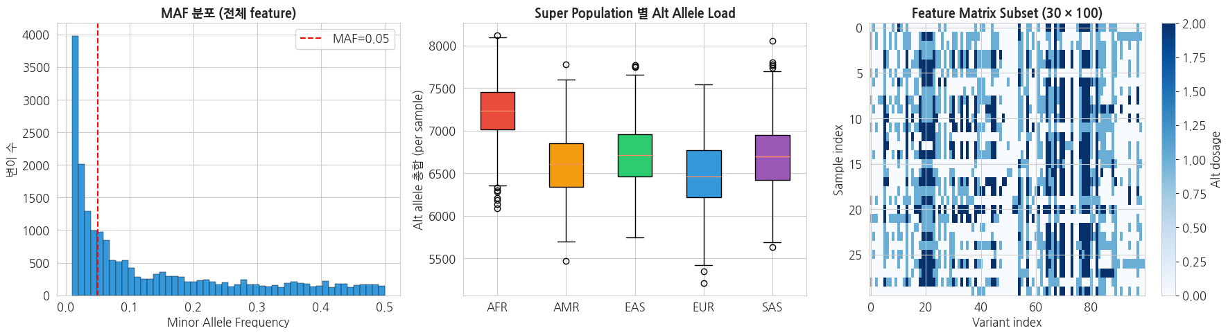
2. 차원 축소 — PCA (Principal Component Analysis)
변이가 수천~수만 개라 표가 너무 넓습니다(=차원이 높습니다). 이렇게 열이 많으면 시각화도 어렵고 모델 학습도 불안정합니다. 차원 축소(dimensionality reduction) 는 이 많은 열을 핵심만 담은 소수의 새 열로 압축하는 작업입니다.
PCA(주성분 분석): 데이터가 가장 넓게 퍼져 있는(=차이가 가장 큰) 방향을 찾아 그 방향을 새 축(주성분, PC)으로 삼는 방법입니다. 수천 개 변이를 PC1, PC2, ... 같은 소수의 축으로 요약하되, 원본의 정보(샘플 간 차이)는 최대한 보존합니다.
2.1 왜 PCA 인가?
- 시각화: 고차원 feature 를 2–3D 로 투영해 인구구조 확인
- 전처리: ML 모델 입력의 차원 축소, 다중공선성 해소
- 인구구조 보정: GWAS/PRS 에서 PC1–10 을 공변량으로 사용
유전체 PCA 의 대표적 해석: PC1 은 주로 대륙(continental ancestry), PC2–3 은 subpopulation 구분.
explained variance(설명 분산)와 scree plot: 각 주성분이 원본 데이터의 차이(분산)를 몇 % 나 담고 있는지를 "설명 분산 비율"이라 합니다. 이를 PC 순서대로 막대로 그린 그림이 scree plot 이며, 앞쪽 몇 개 PC 만으로 충분한지를 눈으로 판단하는 데 씁니다.
python
# Standardize 후 PCA
scaler = StandardScaler()
X_scaled = scaler.fit_transform(X_common)

pca = PCA(n_components=10, random_state=RANDOM_STATE)
X_pca = pca.fit_transform(X_scaled)

print(f'PCA 완료: {X_pca.shape}')
print('\n=== 설명 분산 비율 ===')
for i, ev in enumerate(pca.explained_variance_ratio_):
    print(f'  PC{i+1}: {ev*100:.2f}%  (누적 {pca.explained_variance_ratio_[:i+1].sum()*100:.2f}%)')
text
PCA 완료: (2495, 10)

=== 설명 분산 비율 ===
  PC1: 8.52%  (누적 8.52%)
  PC2: 4.05%  (누적 12.58%)
  PC3: 2.16%  (누적 14.74%)
  PC4: 1.66%  (누적 16.40%)
  PC5: 1.46%  (누적 17.86%)
  PC6: 1.38%  (누적 19.24%)
  PC7: 1.31%  (누적 20.55%)
  PC8: 1.10%  (누적 21.65%)
  PC9: 1.09%  (누적 22.74%)
  PC10: 1.05%  (누적 23.78%)
python
# PCA scatter
fig, axes = plt.subplots(1, 2, figsize=(16, 7))

# 1. PC1 vs PC2
for sp in sp_order:
    mask = y_super_pop == sp
    if mask.sum() > 0:
        axes[0].scatter(X_pca[mask, 0], X_pca[mask, 1],
                         s=20, alpha=0.6, c=sp_colors[sp], label=sp,
                         edgecolors='black', linewidth=0.2)
axes[0].set_title('Super Population PCA (PC1 vs PC2)', fontsize=13, fontweight='bold')
axes[0].set_xlabel(f'PC1 ({pca.explained_variance_ratio_[0]*100:.1f}%)')
axes[0].set_ylabel(f'PC2 ({pca.explained_variance_ratio_[1]*100:.1f}%)')
axes[0].legend(title='Super Pop')

# 2. Scree plot
axes[1].bar(range(1, 11), pca.explained_variance_ratio_ * 100,
            color='#3498db', edgecolor='black')
axes[1].plot(range(1, 11),
             np.cumsum(pca.explained_variance_ratio_) * 100,
             'r-o', linewidth=2, label='누적')
axes[1].set_title('Scree Plot', fontsize=13, fontweight='bold')
axes[1].set_xlabel('PC')
axes[1].set_ylabel('Explained variance (%)')
axes[1].legend()

plt.tight_layout()
plt.show()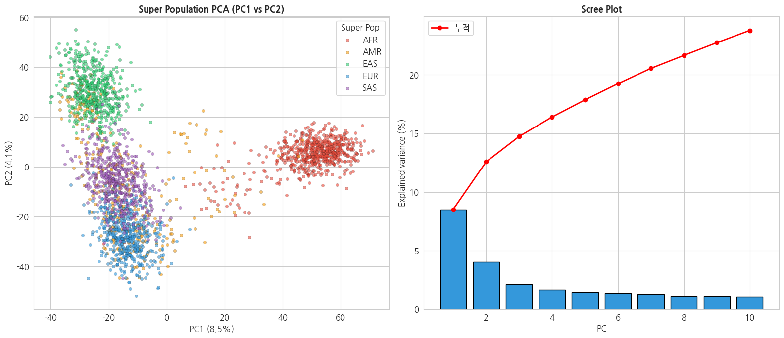
3. Mutational Signature 분석 (SBS96 + NMF)
이 단계에서는 변이가 "어떤 원인으로 생겼는지"의 흔적을 패턴으로 찾아냅니다. 흡연, 자외선, 노화 등 각각의 원인은 DNA 에 서로 다른 종류의 변이를 남기는데, 그 특징적 패턴을 mutational signature(돌연변이 서명) 라고 합니다. 마치 범인마다 다른 지문을 남기듯, 변이 패턴을 보고 원인을 역추적하는 것입니다.
3.1 Mutational Signature 란?
암 종양에서 관찰되는 변이 패턴은 특정 돌연변이 유발 기전(mutagenic process) 에 의해 생깁니다. 예를 들어:
- SBS1: 5-methylcytosine 의 deamination (나이 관련)
- SBS4: 흡연 (담배)
- SBS7a/b: UV 광 손상
- SBS13: APOBEC 효소 활성
- SBS6/15: MMR deficiency
각 signature 는 96-dimensional SBS96 vector 로 표현됩니다:
- 6 substitution types (C>A, C>G, C>T, T>A, T>C, T>G) × 16 trinucleotide contexts (5'N[X>Y]3'N) = 96 classes
SBS6 / SBS96: SBS 는 Single Base Substitution(한 염기가 다른 염기로 바뀐 변이)을 뜻합니다. 바뀐 방향만 보면 6가지(SBS6)이고, 여기에 변이 위치의 양옆 염기까지 함께 고려하면 6 × 16 = 96가지(SBS96)로 더 세밀하게 나뉩니다. signature 는 이 6칸(또는 96칸)에 변이가 각각 몇 % 씩 분포하는지를 나타낸 막대그래프 모양입니다.
3.2 SBS96 Context Matrix 구축
HCC1395 tumor VCF 의 각 SNV 에 5' / 3' 염기 context 를 부여하여 96-class counts 를 구합니다.
⚠️ 정확한 context 분석은 reference fasta 가 필요합니다. 여기서는 VCF 의 REF 만 사용한 단순화된 6-class → 96-class 시뮬레이션을 수행합니다.
python
# 6-class 기본 변이 유형 (상보적 쌍 합산 → pyrimidine 기준)
def to_pyrimidine_context(ref, alt):
    """SBS96 표준: REF 가 C 또는 T 가 되도록 상보적 변환"""
    complement = {'A': 'T', 'T': 'A', 'C': 'G', 'G': 'C'}
    if ref in ('C', 'T'):
        return ref, alt
    else:
        return complement[ref], complement[alt]

# HCC1395 SNV 추출 + SBS6 context 계산
# (실제 SBS96 에는 5'/3' flanking base 필요 - 여기서는 6-class 로 단순화 시연)
snv_counts = Counter()
vcf = VCF(SOMATIC_VCF)
for v in vcf:
    if len(v.REF) != 1:
        continue
    for alt in v.ALT:
        if len(alt) != 1:
            continue
        ref_py, alt_py = to_pyrimidine_context(v.REF, alt)
        snv_counts[f'{ref_py}>{alt_py}'] += 1
vcf.close()

sub_order = ['C>A', 'C>G', 'C>T', 'T>A', 'T>C', 'T>G']
sbs6_vector = np.array([snv_counts.get(s, 0) for s in sub_order])
total_snv = sbs6_vector.sum()

print('=== HCC1395 chr22 SBS6 Profile ===')
for sub, cnt in zip(sub_order, sbs6_vector):
    pct = cnt / total_snv * 100 if total_snv else 0
    print(f'  {sub:5s}: {cnt:>4}  ({pct:5.1f}%)')
text
=== HCC1395 chr22 SBS6 Profile ===
  C>A  :   92  ( 14.7%)
  C>G  :  142  ( 22.6%)
  C>T  :  257  ( 41.0%)
  T>A  :   39  (  6.2%)
  T>C  :   69  ( 11.0%)
  T>G  :   28  (  4.5%)
3.3 다중 샘플 SBS6 Matrix + NMF
NMF(Non-negative Matrix Factorization, 비음수 행렬 분해): 여러 샘플의 변이 패턴이 섞여 있는 큰 표를, 몇 개의 "기본 패턴(signature)"과 "각 샘플이 그 패턴을 얼마나 가졌는지(exposure)"의 곱으로 쪼개는 방법입니다. 칵테일(샘플)을 보고 들어간 원액(signature)과 그 비율(exposure)을 거꾸로 알아내는 것에 비유할 수 있습니다. 변이 개수는 음수가 될 수 없으므로 모든 값을 0 이상으로 제한(비음수)합니다.
NMF 는 $V \approx W \cdot H$ 로 분해합니다.
- $V$: 샘플 × mutation type (N × 6 또는 N × 96)
- $W$: 샘플 × signature exposure (N × K)
- $H$: signature × mutation type (K × 6)
exposure(노출도): 한 샘플의 변이가 각 signature 에서 얼마만큼 기여해 생겼는지를 나타내는 비율(위 식의 $W$)입니다. 예: "이 샘플의 변이는 Signature 1 이 70%, Signature 2 가 30%."
여기서는 1000G 코호트의 다양한 샘플로 SBS6 matrix 를 만들어 NMF 를 시연합니다.
python
# 1000G 샘플 중 N_SAMPLES 개의 개인 변이로 SBS6 profile 구축
N_SAMPLES_MUT = 20

# cohort 샘플 중 무작위 20명 선택
rng = np.random.RandomState(RANDOM_STATE)
sampled_idx = rng.choice(len(sample_ids), size=N_SAMPLES_MUT, replace=False)
mut_samples = [sample_ids[i] for i in sampled_idx]
mut_labels = [y_super_pop[i] for i in sampled_idx]

print('=== Mutational signature 분석 대상 샘플 ===')
for s, lb in zip(mut_samples[:5], mut_labels[:5]):
    print(f'  {s}  ({lb})')
print(f'  ... (총 {N_SAMPLES_MUT} 샘플)')

# 각 샘플의 SBS6 profile 수집 (개인 Germline 변이 기반)
sbs_matrix = []
for sname in mut_samples:
    r = subprocess.run(
        ['bcftools', 'view', '-s', sname, '--min-ac', '1',
         '-v', 'snps', '-H', GERMLINE_VCF],
        capture_output=True, text=True
    )
    cnt = Counter()
    for line in r.stdout.strip().split('\n'):
        if not line.strip():
            continue
        f = line.split('\t')
        ref = f[3]
        for a in f[4].split(','):
            if len(a) == 1 and len(ref) == 1:
                r_py, a_py = to_pyrimidine_context(ref, a)
                cnt[f'{r_py}>{a_py}'] += 1
    sbs_matrix.append([cnt.get(s, 0) for s in sub_order])

V = np.array(sbs_matrix, dtype=float)

# HCC1395 를 마지막 행으로 추가
V = np.vstack([V, sbs6_vector.reshape(1, -1)])
mut_samples_all = mut_samples + ['HCC1395_tumor']
mut_labels_all = mut_labels + ['TUMOR']

print(f'\nSBS6 Matrix V shape: {V.shape}  (각 행 = 샘플, 각 열 = 치환 유형)')

# 저장
sbs_df = pd.DataFrame(V, index=mut_samples_all, columns=sub_order)
sbs_df['label'] = mut_labels_all
sbs_df.to_csv(f'{COHORT_DIR}/sbs96_matrix.tsv', sep='\t')
print(f'SBS matrix 저장: {COHORT_DIR}/sbs96_matrix.tsv')
text
=== Mutational signature 분석 대상 샘플 ===
  NA20506  (EUR)
  NA18642  (EAS)
  HG02364  (EAS)
  NA19834  (AFR)
  HG02837  (AFR)
  ... (총 20 샘플)

SBS6 Matrix V shape: (21, 6)  (각 행 = 샘플, 각 열 = 치환 유형)
SBS matrix 저장: /tier4/DSC/jheepark/bbp-wgs-data/cohort/sbs96_matrix.tsv
python
# NMF 분해 (K=3 signature)
K = 3

# 행별 normalize (signature 상대 분포 해석을 위해)
V_norm = V / V.sum(axis=1, keepdims=True)

nmf_model = NMF(n_components=K, init='nndsvd',
                random_state=RANDOM_STATE, max_iter=500)
W = nmf_model.fit_transform(V_norm)  # 샘플 × signature
H = nmf_model.components_             # signature × mutation type

# Signature 별 normalize
H_norm = H / H.sum(axis=1, keepdims=True)

print(f'NMF 분해: V({V_norm.shape}) ≈ W({W.shape}) × H({H_norm.shape})')
print(f'재구성 오차: {nmf_model.reconstruction_err_:.4f}')

# Signature 저장
sig_df = pd.DataFrame(H_norm, columns=sub_order,
                       index=[f'Signature_{k+1}' for k in range(K)])
sig_df.to_csv(f'{COHORT_DIR}/nmf_signatures.tsv', sep='\t')
print(f'\nNMF Signatures 저장: {COHORT_DIR}/nmf_signatures.tsv')
text
NMF 분해: V((21, 6)) ≈ W((21, 3)) × H((3, 6))
재구성 오차: 0.0054

NMF Signatures 저장: /tier4/DSC/jheepark/bbp-wgs-data/cohort/nmf_signatures.tsv
python
# NMF 결과 시각화
fig, axes = plt.subplots(2, 2, figsize=(16, 10))

# 1. 추출된 signatures
sig_colors_bar = ['#1ebff0', '#050708', '#e62725', '#cbcacb', '#a1cf64', '#edc8c5']
for k in range(K):
    ax = axes[0, 0] if k == 0 else (axes[0, 1] if k == 1 else axes[1, 0])
    bars = ax.bar(sub_order, H_norm[k], color=sig_colors_bar,
                   edgecolor='black', linewidth=0.5)
    ax.set_title(f'Signature {k+1}', fontsize=13, fontweight='bold')
    ax.set_ylabel('Fraction')
    ax.set_ylim(0, max(H_norm.flatten()) * 1.15)
    for bar, val in zip(bars, H_norm[k]):
        ax.text(bar.get_x() + bar.get_width()/2,
                 bar.get_height() + 0.01,
                 f'{val*100:.0f}%', ha='center', fontsize=9)

# 2. 샘플별 signature exposure
ax = axes[1, 1]
W_norm = W / W.sum(axis=1, keepdims=True)
x = np.arange(len(mut_samples_all))
bottom = np.zeros(len(mut_samples_all))
sig_cmap = ['#3498db', '#e74c3c', '#2ecc71']
for k in range(K):
    ax.bar(x, W_norm[:, k], bottom=bottom,
            color=sig_cmap[k], label=f'Signature {k+1}',
            edgecolor='black', linewidth=0.3)
    bottom += W_norm[:, k]

# Label 표시 (마지막 샘플 HCC1395 강조)
xlabels = [f'{s[:8]}\n({lb})' for s, lb in zip(mut_samples_all, mut_labels_all)]
ax.set_xticks(x)
ax.set_xticklabels(xlabels, rotation=90, fontsize=8)
ax.axvline(len(mut_samples_all) - 1.5, color='red', linestyle='--',
            linewidth=1, alpha=0.7)
ax.text(len(mut_samples_all) - 1, 1.02, 'TUMOR',
         ha='center', color='red', fontweight='bold')
ax.set_title('샘플별 Signature Exposure', fontsize=13, fontweight='bold')
ax.set_ylabel('Signature 비율')
ax.legend(loc='upper left', fontsize=9)
ax.set_ylim(0, 1.1)

plt.tight_layout()
plt.show()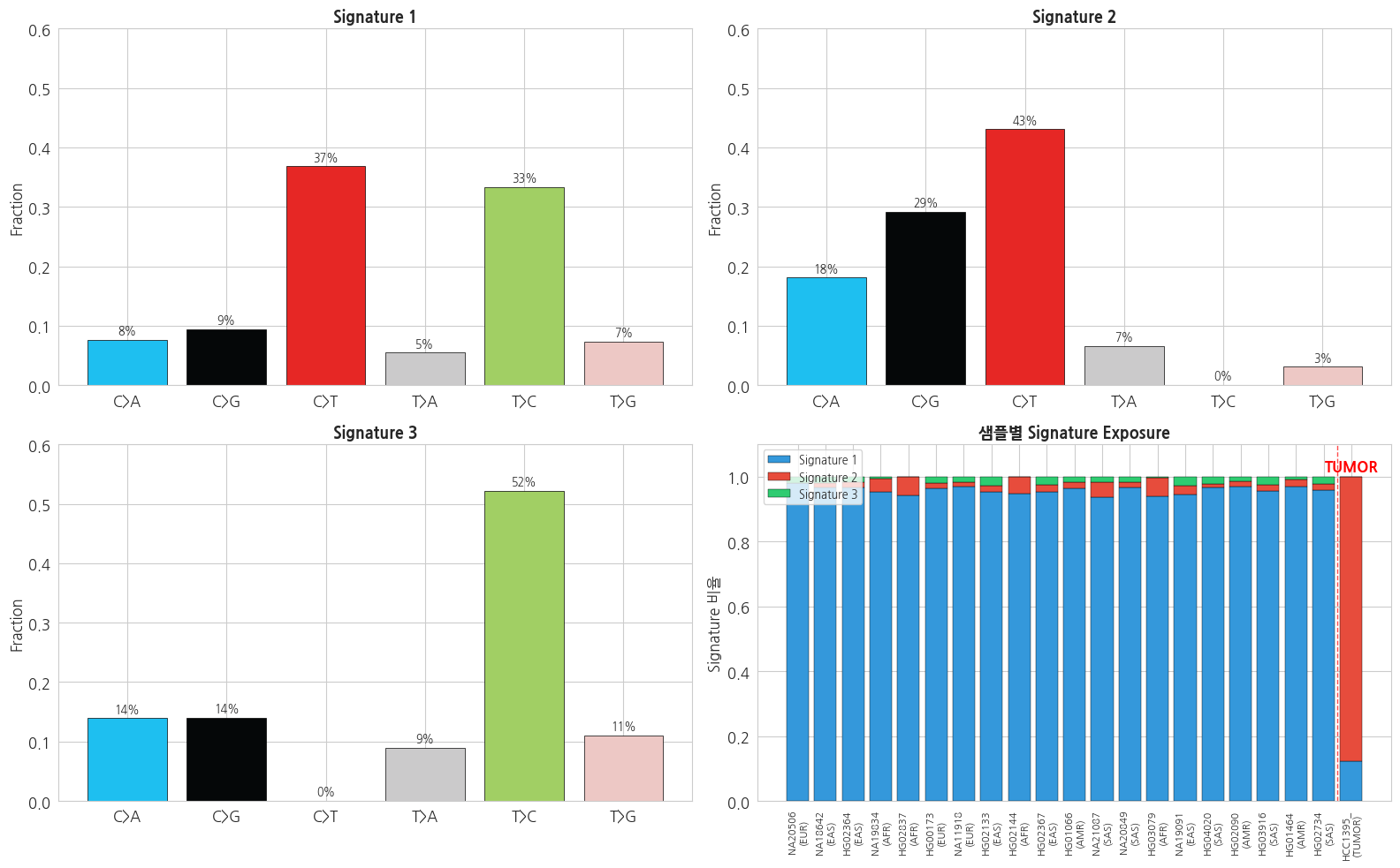
3.4 해석
- Germline (1000G) 샘플들은 비슷한 signature 비율 — 인류 공통의 background mutation 패턴
- Somatic (HCC1395) 은 뚜렷이 다른 패턴 — 암 특이 mutagenic process (e.g. APOBEC)
- 실제 COSMIC SBS signature database 와 cosine similarity 로 매칭하면 구체적 유발 원인을 추정할 수 있음
- 정교한 분석은 SigProfilerExtractor, deconstructSigs, sigfit 등 전용 도구 사용
4. 머신러닝 기반 질병/형질 예측
이 단계에서는 앞서 만든 유전체 특징(PCA 결과)을 입력으로, 샘플의 라벨(여기서는 EAS 인지 아닌지)을 맞히도록 머신러닝(machine learning) 모델을 학습시킵니다.
machine learning / 이진 분류(binary classification): 정답(라벨)이 붙은 데이터를 모델에 보여주며 "입력 → 정답" 규칙을 스스로 익히게 하는 방법입니다. 정답이 두 가지(예/아니오, 여기서는 EAS=1 / Non-EAS=0)뿐인 경우를 이진 분류라고 합니다. 모델은 학습에 쓰지 않은 새 샘플의 라벨을 예측합니다.
여기서 비교하는 세 모델은 모두 이진 분류용 알고리즘입니다: logistic regression(로지스틱 회귀, 입력의 가중합으로 확률 추정), random forest(랜덤 포레스트, 여러 결정 트리의 다수결), gradient boosting(그래디언트 부스팅, 틀린 부분을 보완하는 트리를 순차적으로 쌓음).
4.1 Task 정의: EAS super population 예측
4강 GWAS 와 동일하게 "EAS 여부" 를 예측하는 이진 분류 문제로 demonstration 합니다. 실제 임상에서는:
- Case/Control 질병 분류: 당뇨, 암, 희귀질환 등
- Quantitative trait 예측: BMI, 혈압, 약물반응
- survival 분석 (Cox regression 기반)
4.2 Train/Test Split + Baseline 모델
train/test split: 데이터를 학습용(train)과 시험용(test)으로 나눕니다. 시험용은 학습에 쓰지 않고 남겨두었다가, 모델이 처음 보는 데이터에서도 잘 맞히는지(=일반화) 평가하는 데 씁니다.
python
# Feature (X_common)와 label(y_binary) 준비
# PCA 결과 X_pca 사용 (차원 축소 후) - 속도와 일반화 양쪽 이점
X_input = X_pca  # 10-D PCA features
y = y_binary

# Train/Test split (stratified)
X_train, X_test, y_train, y_test = train_test_split(
    X_input, y, test_size=0.25, random_state=RANDOM_STATE, stratify=y
)

print(f'Train: X={X_train.shape}, y={y_train.shape}, case ratio={y_train.mean():.2%}')
print(f'Test : X={X_test.shape}, y={y_test.shape}, case ratio={y_test.mean():.2%}')
text
Train: X=(1871, 10), y=(1871,), case ratio=20.15%
Test : X=(624, 10), y=(624,), case ratio=20.19%
4.3 다중 모델 학습 및 비교
세 모델을 같은 기준으로 비교합니다. 평가에는 cross validation 과 ROC AUC 를 씁니다.
5-fold cross validation(5겹 교차검증): 학습 데이터를 5조각으로 나눠, 그중 4조각으로 학습하고 1조각으로 평가하기를 조각을 바꿔가며 5번 반복합니다. 데이터를 한 번만 나눴을 때 생기는 운에 따른 편차를 줄여 성능을 더 안정적으로 추정하는 방법입니다.
ROC AUC: 분류 모델의 성능 점수입니다. 0.5 면 동전 던지기 수준(무의미), 1.0 이면 완벽한 분류를 뜻합니다. 양성/음성을 가르는 기준점(threshold)을 바꿔가며 측정하므로, 라벨이 한쪽으로 치우친 데이터에서도 정확도(accuracy)보다 공정한 비교가 가능합니다.
python
# 세 모델 비교: Logistic / RandomForest / GradientBoosting
models = {
    'Logistic Regression': LogisticRegression(max_iter=1000, random_state=RANDOM_STATE),
    'Random Forest': RandomForestClassifier(n_estimators=200,
                                              max_depth=8,
                                              random_state=RANDOM_STATE,
                                              n_jobs=-1),
    'Gradient Boosting': GradientBoostingClassifier(n_estimators=100,
                                                      max_depth=3,
                                                      random_state=RANDOM_STATE),
}

results = {}
cv = StratifiedKFold(n_splits=5, shuffle=True, random_state=RANDOM_STATE)

for name, model in models.items():
    # Cross-validation
    cv_scores = cross_val_score(model, X_train, y_train, cv=cv,
                                 scoring='roc_auc', n_jobs=-1)
    # Test set 평가
    model.fit(X_train, y_train)
    y_pred = model.predict(X_test)
    y_proba = model.predict_proba(X_test)[:, 1]

    results[name] = {
        'model': model,
        'cv_auc_mean': cv_scores.mean(),
        'cv_auc_std': cv_scores.std(),
        'test_accuracy': accuracy_score(y_test, y_pred),
        'test_auc': roc_auc_score(y_test, y_proba),
        'y_pred': y_pred,
        'y_proba': y_proba,
    }

# 결과 요약
print(f'{"Model":<22} {"CV AUC":<18} {"Test Acc":<10} {"Test AUC":<10}')
print('-' * 65)
for name, r in results.items():
    print(f'{name:<22} {r["cv_auc_mean"]:.3f} ± {r["cv_auc_std"]:.3f}  '
          f'{r["test_accuracy"]:<10.3f} {r["test_auc"]:<10.3f}')
text
Model                  CV AUC             Test Acc   Test AUC
-----------------------------------------------------------------
Logistic Regression    0.995 ± 0.001  0.974      0.996
Random Forest          0.996 ± 0.001  0.978      0.992
Gradient Boosting      0.995 ± 0.002  0.979      0.994
4.4 ROC Curve 및 Confusion Matrix
ROC curve(ROC 곡선): 기준점을 바꿔가며 "실제 양성을 양성으로 맞힌 비율(TPR)"과 "실제 음성을 양성으로 잘못 본 비율(FPR)"의 관계를 그린 곡선입니다. 곡선이 왼쪽 위로 붙을수록 좋은 모델이며, 곡선 아래 면적이 바로 위에서 본 AUC 입니다.
confusion matrix(혼동 행렬): 예측이 실제와 얼마나 맞고 틀렸는지를 2×2 표로 보여줍니다. 어떤 종류의 오류(양성을 음성으로, 또는 그 반대)가 많은지 한눈에 파악할 수 있습니다.
feature importance(특징 중요도): 모델이 예측할 때 각 입력 특징(여기서는 PC1, PC2, ...)을 얼마나 비중 있게 사용했는지를 나타냅니다. 값이 클수록 그 특징이 분류에 더 결정적이었다는 뜻입니다.
python
# 시각화: ROC + Confusion Matrix + Feature Importance
fig, axes = plt.subplots(1, 3, figsize=(18, 5))

# 1. ROC Curves
for name, r in results.items():
    fpr, tpr, _ = roc_curve(y_test, r['y_proba'])
    axes[0].plot(fpr, tpr, linewidth=2,
                  label=f'{name} (AUC={r["test_auc"]:.3f})')
axes[0].plot([0, 1], [0, 1], 'k--', alpha=0.5, linewidth=1)
axes[0].set_xlabel('False Positive Rate')
axes[0].set_ylabel('True Positive Rate')
axes[0].set_title('ROC Curves', fontsize=13, fontweight='bold')
axes[0].legend(loc='lower right')

# 2. 최고 성능 모델의 Confusion Matrix
best_name = max(results, key=lambda k: results[k]['test_auc'])
cm = confusion_matrix(y_test, results[best_name]['y_pred'])
sns.heatmap(cm, annot=True, fmt='d', cmap='Blues',
            xticklabels=['Non-EAS', 'EAS'],
            yticklabels=['Non-EAS', 'EAS'], ax=axes[1])
axes[1].set_title(f'Confusion Matrix ({best_name})',
                   fontsize=13, fontweight='bold')
axes[1].set_xlabel('Predicted')
axes[1].set_ylabel('Actual')

# 3. Feature Importance (Random Forest 기준)
rf_model = results['Random Forest']['model']
importances = rf_model.feature_importances_
pc_labels = [f'PC{i+1}' for i in range(len(importances))]
sort_idx = np.argsort(importances)[::-1]
axes[2].barh([pc_labels[i] for i in sort_idx[::-1]],
              [importances[i] for i in sort_idx[::-1]],
              color='#2ecc71', edgecolor='black', linewidth=0.5)
axes[2].set_title('Feature Importance (Random Forest)',
                   fontsize=13, fontweight='bold')
axes[2].set_xlabel('Importance')

plt.tight_layout()
plt.show()

print(f'\n=== 최고 성능 모델 ({best_name}) Classification Report ===')
print(classification_report(y_test, results[best_name]['y_pred'],
                             target_names=['Non-EAS', 'EAS']))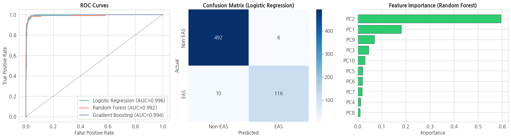
text
=== 최고 성능 모델 (Logistic Regression) Classification Report ===
              precision    recall  f1-score   support

     Non-EAS       0.98      0.99      0.98       498
         EAS       0.95      0.92      0.94       126

    accuracy                           0.97       624
   macro avg       0.97      0.95      0.96       624
weighted avg       0.97      0.97      0.97       624
4.5 예측 결과 저장 및 개별 샘플 해석
python
# 전체 샘플 예측 (full dataset 재학습 후)
best_model = results[best_name]['model']
best_model.fit(X_input, y)  # 전체 데이터로 재학습
y_pred_all = best_model.predict(X_input)
y_proba_all = best_model.predict_proba(X_input)[:, 1]

# 결과 DataFrame
pred_df = pd.DataFrame({
    'sample': sample_ids,
    'super_pop': y_super_pop,
    'y_true': y,
    'y_pred': y_pred_all,
    'proba_EAS': y_proba_all,
    'correct': (y_pred_all == y).astype(int),
})

# 저장
pred_out = f'{COHORT_DIR}/ml_predictions.tsv'
pred_df.to_csv(pred_out, sep='\t', index=False)
print(f'ML 예측 결과 저장: {pred_out}')

# Super Population 별 정확도
print('\n=== Super Population 별 분류 정확도 ===')
acc_by_sp = pred_df.groupby('super_pop').agg(
    n=('sample', 'count'),
    accuracy=('correct', 'mean'),
    mean_proba=('proba_EAS', 'mean'),
).round(3)
print(acc_by_sp)

# 오분류 된 샘플 예시
misclass = pred_df[pred_df['correct'] == 0].sort_values('proba_EAS', ascending=False)
print(f'\n오분류 샘플 수: {len(misclass)} / {len(pred_df)}  ({len(misclass)/len(pred_df)*100:.1f}%)')
if len(misclass):
    print('\n=== 오분류 샘플 상위 5개 ===')
    print(misclass.head(5).to_string(index=False))
text
ML 예측 결과 저장: /tier4/DSC/jheepark/bbp-wgs-data/cohort/ml_predictions.tsv

=== Super Population 별 분류 정확도 ===
             n  accuracy  mean_proba
super_pop
AFR        658     1.000       0.002
AMR        347     0.937       0.080
EAS        503     0.936       0.905
EUR        499     1.000       0.000
SAS        488     0.980       0.038

오분류 샘플 수: 64 / 2495  (2.6%)

=== 오분류 샘플 상위 5개 ===
 sample super_pop  y_true  y_pred  proba_EAS  correct
HG02272       AMR       0       1   0.980516        0
HG01441       AMR       0       1   0.976130        0
NA19749       AMR       0       1   0.971763        0
NA19664       AMR       0       1   0.969843        0
HG03604       SAS       0       1   0.967756        0
4.6 예측 confidence 분포
python
# Super Population 별 prediction probability 분포
fig, ax = plt.subplots(figsize=(14, 6))

for sp in sp_order:
    mask = pred_df['super_pop'] == sp
    if mask.sum() > 0:
        ax.hist(pred_df.loc[mask, 'proba_EAS'],
                 bins=30, alpha=0.5,
                 label=f'{sp} (n={mask.sum()})',
                 color=sp_colors[sp], edgecolor='black', linewidth=0.3)
ax.axvline(0.5, color='red', linestyle='--',
           linewidth=1.5, label='Decision boundary (0.5)')
ax.set_xlabel('Predicted P(EAS)')
ax.set_ylabel('샘플 수')
ax.set_title('Super Population 별 예측 확률 분포',
              fontsize=13, fontweight='bold')
ax.legend(loc='upper center', ncol=3)
plt.tight_layout()
plt.show()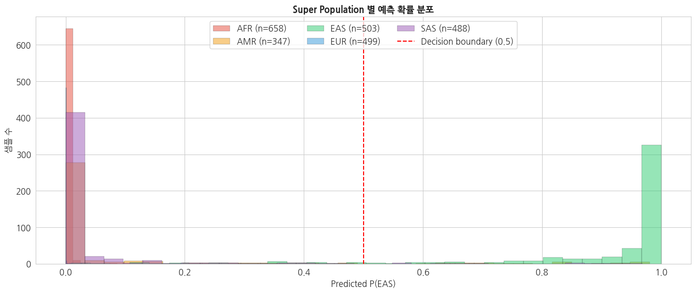
5. 요약 및 확장 방향
이번 강의 요약
| 단계 | 내용 |
|---|---|
| Feature Matrix | Cohort VCF → (샘플 × SNP) sparse dosage matrix, MAF≥0.05 filter |
| 차원 축소 | StandardScaler + PCA(10) — PC1/PC2 로 인구구조 확인 |
| Mutational Signature | SBS6 counts → NMF(K=3) — Germline vs Somatic signature 차이 |
| ML 예측 | Logistic / RF / GB 3개 모델 비교, ROC AUC 로 평가 |
| 산출물 | feature_matrix.npz, sbs96_matrix.tsv, nmf_signatures.tsv, ml_predictions.tsv |
핵심 포인트
- 유전체 데이터의 sparsity — sparse matrix 로 처리하면 메모리를 대폭 절약
- 차원 축소는 거의 필수 — raw SNP 수십만 → PCA 10–20 components
- PCA 주성분 = 인구구조 지표 — PC1–5 는 GWAS covariate 로 자주 사용
- Mutational signature 는 암 연구의 핵심 — COSMIC SBS database 와 매칭 해석
- ML 모델은 데이터가 충분할 때만 — WGS 1만 샘플 이상 권장, 그 이하면 PRS 가 더 안정적
확장 방향
| 주제 | 도구/방법 |
|---|---|
| Rare variant 분석 | Burden test, SKAT, variant collapsing |
| Mutational signature 정밀화 | SigProfilerExtractor, 96-class trinucleotide context, COSMIC v3 |
| Deep Learning | DeepSEA, Enformer, DNABERT (서열 기반) |
| Multi-omics 통합 | CNV + expression + methylation + WGS |
| 임상 적용 | UK Biobank PRS, AlphaFold 기반 구조 예측, ClinVar + VEP + gnomAD 자동 curation |
전체 튜토리얼 완료!
BBP WGS 튜토리얼 1–5강을 통해 다음을 학습했습니다:
- 1강: 임상/표현형 데이터 기초 통계 및 인구집단 분석
- 2강: VCF 포맷, 변이 타입 분포, Mutation Profile, 필터링
- 3강: 개인 변이 해석 — ClinVar + VEP annotation, Germline/Somatic 비교
- 4강: 코호트 분석 — QC, GWAS, PRS
- 5강: AI 기반 feature engineering, Mutational signature, ML 질병 예측
이후 연구에서는 각 강의의 산출물을 재사용하여 더 큰 코호트, 다중 염색체, 다중 phenotype, 다중 omics 로 확장할 수 있습니다.